UBEstrefa.pl
Redesigning Ubestrefa.pl – A Modern Platform for Poland’s Leading Insurance Partner
Deliverables
Deliverables
UI Design
UI Design
Tasks
Tasks
Redesign
Duration
Duration
1 day
1 day
Tools
Tools
Figma
Figma
📑 Context
📑 Context
📑 Context

UBEstrefa.pl is a partner insurance platform linked to PZU, Poland’s largest insurance group. Therefore, it was crucial to maintain visual consistency.
I was given access to the staging environment and tasked with designing a new dashboard UI that visually aligns with the mojePZU ecosystem, ensuring a consistent user experience across both services.
❌ Problem
❌ Problem
❌ Problem
Current dashboard had:
Current dashboard had:
Outdated UI,
Outdated UI,
Hidden navigation (hamburger menu),
Hidden navigation (hamburger menu),
No space for sales or engagement,
No space for sales or engagement,
Visually disconnected from PZU’s website.
Visually disconnected from PZU’s website.
✅ My solution
✅ My solution
✅ My solution
A modern, user-friendly interface that feels native to the PZU ecosystem.
A modern, user-friendly interface that feels native to the PZU ecosystem.

Visible, intuitive navigation — no hamburger menu,
Visible, intuitive navigation — no hamburger menu,
Full brand alignment (colors, icons, spacing, typography),
Full brand alignment (colors, icons, spacing, typography),
Sales & promo sections to boost user engagement,
Sales & promo sections to boost user engagement,
Responsive design with clear info hierarchy on all devices.
Responsive design with clear info hierarchy on all devices.
🛠️ Redesign process in 3 steps
🛠️ Redesign process in 3 steps
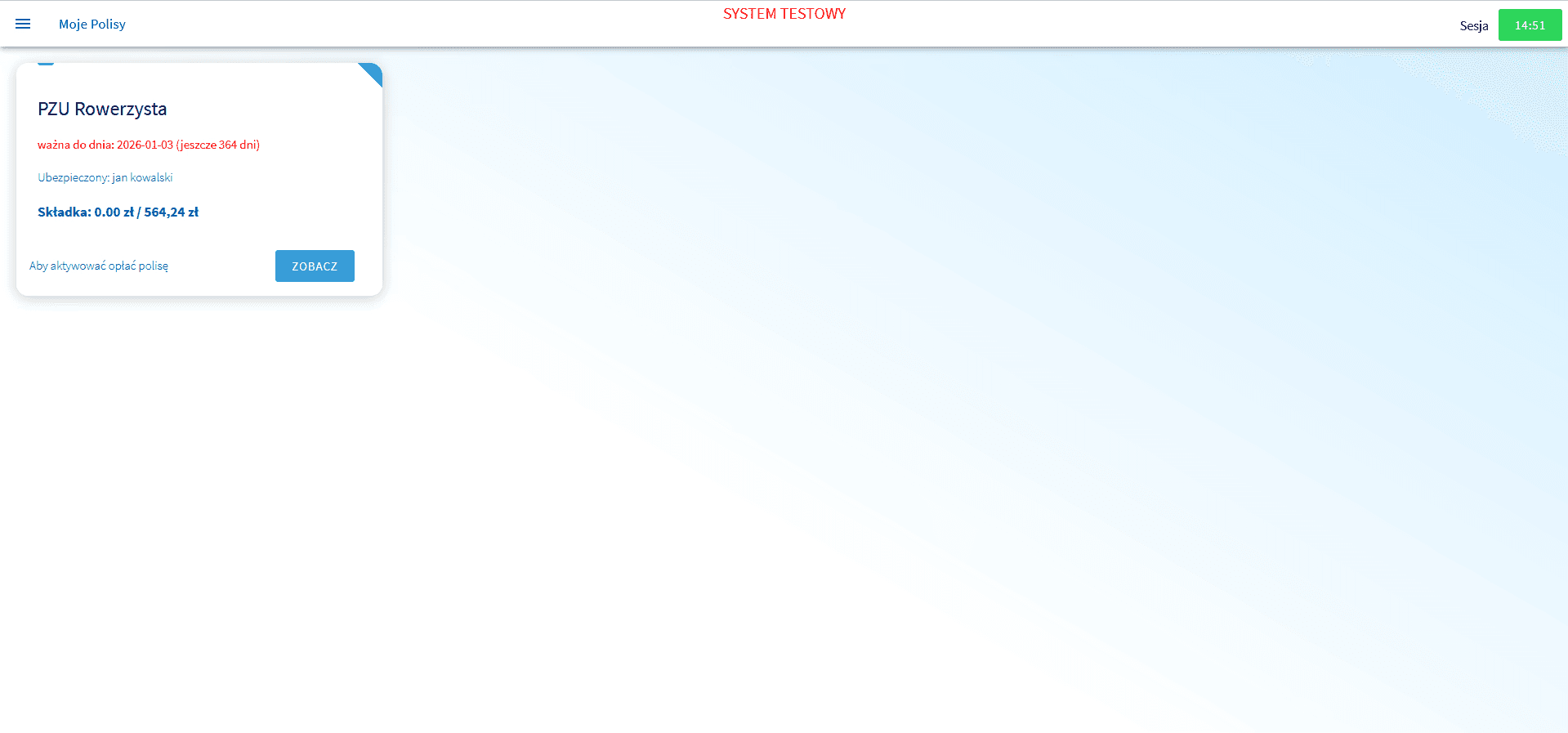
First look of UBEstrefa.pl - what I got from a client
Visually unbalanced layout with excessive white space,
No clear structure or content hierarchy — doesn’t feel like a real dashboard,
Missing visual cues, headlines, or contextual sections,
No marketing or engagement elements (e.g. offers, tips, CTAs),
Navigation hidden in a hamburger menu, limiting discoverability.
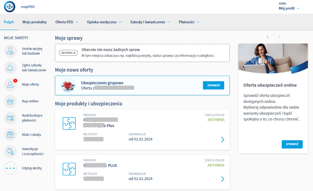
Already existing website I was supposed to base my work on - moje.pzu.pl
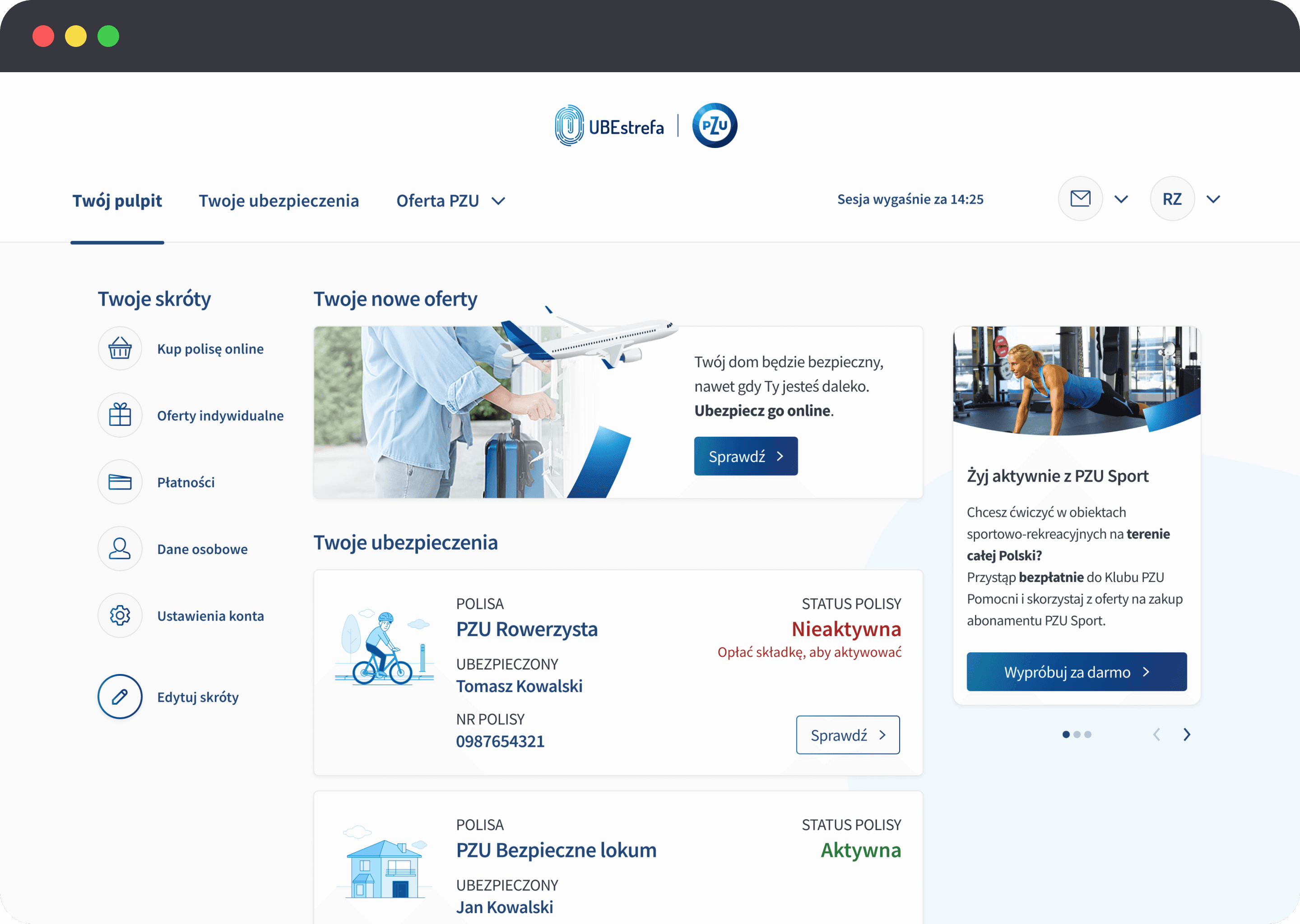
Final outcome
Clear, structured layout that feels like a real dashboard
More modern and up to date look,
No wasted space — layout is functional and focused
Brand-inspired illustrations add a friendly, human touch (from PZU's brand book)
Buttons with tailored microcopy and proper hierarchy
Session expiry shown as a neutral alert, not misleading
🛠️Redesign process
First look of UBEstrefa.pl - what I got from a client
Visually unbalanced layout with excessive white space,
No clear structure or content hierarchy — doesn’t feel like a real dashboard,
Missing visual cues, headlines, or contextual sections,
No marketing or engagement elements (e.g. offers, tips, CTAs),
Navigation hidden in a hamburger menu, limiting discoverability.
Already existing website I was supposed to base my work on - moje.pzu.pl
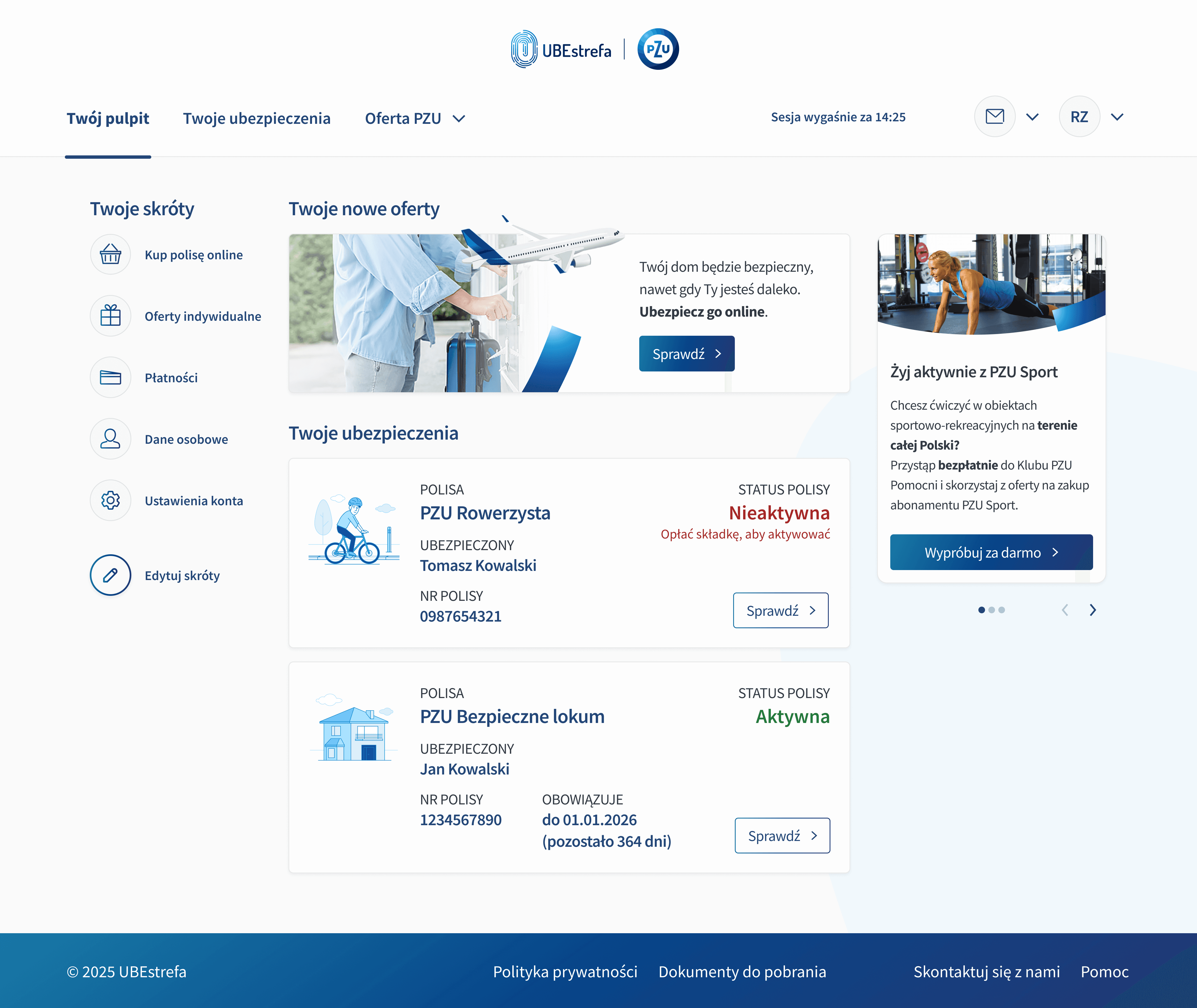
Final outcome
Clear, structured layout that feels like a real dashboard
More modern and up to date look,
No wasted space — layout is functional and focused
Brand-inspired illustrations add a friendly, human touch (from PZU's brand book)
Buttons with tailored microcopy and proper hierarchy
Session expiry shown as a neutral alert, not misleading